Chapter 17 Working with geospatial data
When data contain geographic coordinates, they can be considered a type of spatial data. Like the “text as data” that we explore in Chapter 19, spatial data are fundamentally different from the numerical data with which we most often work. While spatial coordinates are often encoded as numbers, these numbers have special meaning, and our ability to understand them will suffer if we do not recognize their spatial nature.
The field of spatial statistics concerns building and interpreting models that include spatial coordinates. For example, consider a model for airport traffic using the airlines data. These data contain the geographic coordinates of each airport, so they are spatially-aware. But simply including the coordinates for latitude and longitude as covariates in a multiple regression model does not take advantage of the special meaning that these coordinates encode. In such a model we might be led towards the meaningless conclusion that airports at higher latitudes are associated with greater airplane traffic—simply due to the limited nature of the model and our careless and inappropriate use of these spatial data.
A full treatment of spatial statistics is beyond the scope of this book. While we won’t be building spatial models in this chapter, we will learn how to manage and visualize geospatial data in R. We will learn about how to work with shapefiles, which are a de facto open specification data structure for encoding spatial information. We will learn about projections (from three-dimensional space into two-dimensional space), colors (again), and how to create informative, and not misleading, spatially-aware visualizations. Our goal—as always—is to provide the reader with the technical ability and intellectual know-how to derive meaning from geospatial data.
17.1 Motivation: What’s so great about geospatial data?
The most famous early analysis of geospatial data was done by physician John Snow in 1854. In a certain London neighborhood, an outbreak of cholera killed 127 people in three days, resulting in a mass exodus of the local residents. At the time it was thought that cholera was an airborne disease caused by breathing foul air. Snow was critical of this theory, and set about discovering the true transmission mechanism.
Consider how you might use data to approach this problem. At the hospital, they might have a list of all of the patients that died of cholera. Those data might look like what is presented in Table 17.1.
| Date | Last_Name | First_Name | Address | Age | Cause_death |
|---|---|---|---|---|---|
| Aug 31, 1854 | Jones | Thomas | 26 Broad St. | 37 | cholera |
| Aug 31, 1854 | Jones | Mary | 26 Broad St. | 11 | cholera |
| Oct 1, 1854 | Warwick | Martin | 14 Broad St. | 23 | cholera |
Snow’s genius was in focusing his analysis on the Address column. In a literal sense, the Address variable is a character vector—it stores text. This text has no obvious medical significance with respect to cholera. But we as human beings recognize that these strings of text encode geographic locations—they are geospatial data. Snow’s insight into this outbreak involved simply plotting these data in a geographically relevant way (see Figure 17.2).
The CholeraDeaths data are included in the mdsr package. When you plot the address of each person who died from cholera, you get something similar to what is shown in Figure 17.1.
library(tidyverse)
library(mdsr)
library(sf)
plot(CholeraDeaths["Count"])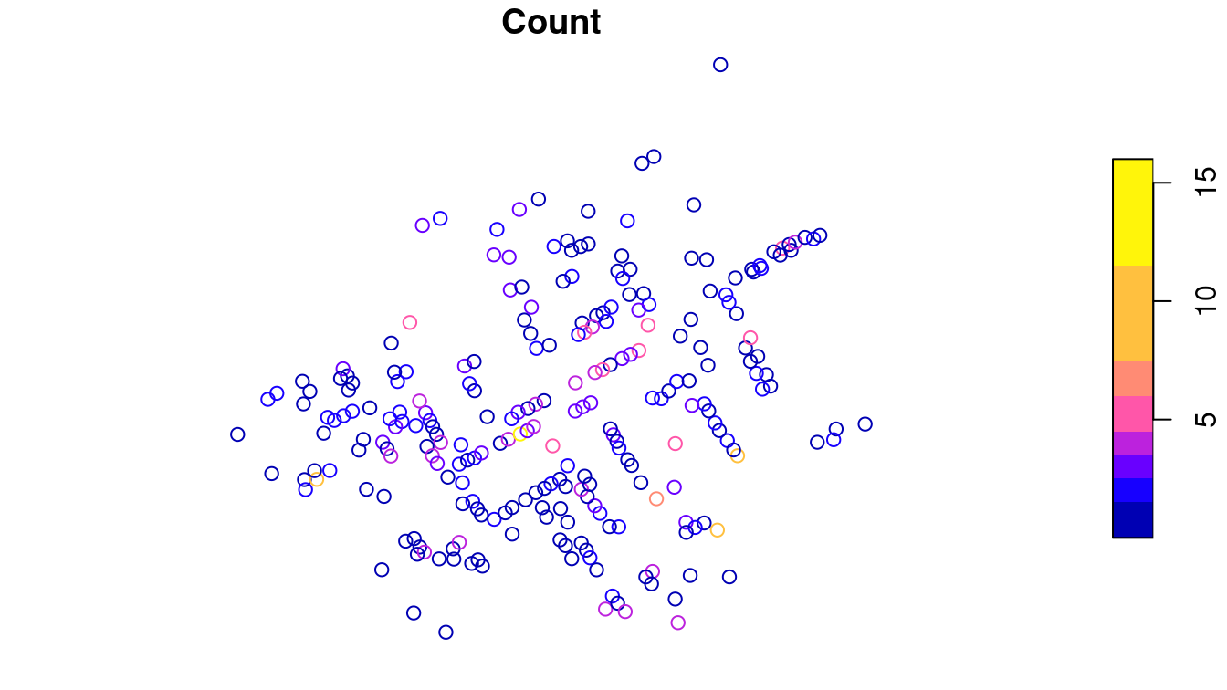
Figure 17.1: Context-free plot of 1854 cholera deaths.
While you might see certain patterns in these data, there is no context provided. The map that Snow actually drew is presented in Figure 17.2. The underlying map of the London streets provides helpful context that makes the information in Figure 17.1 intelligible.
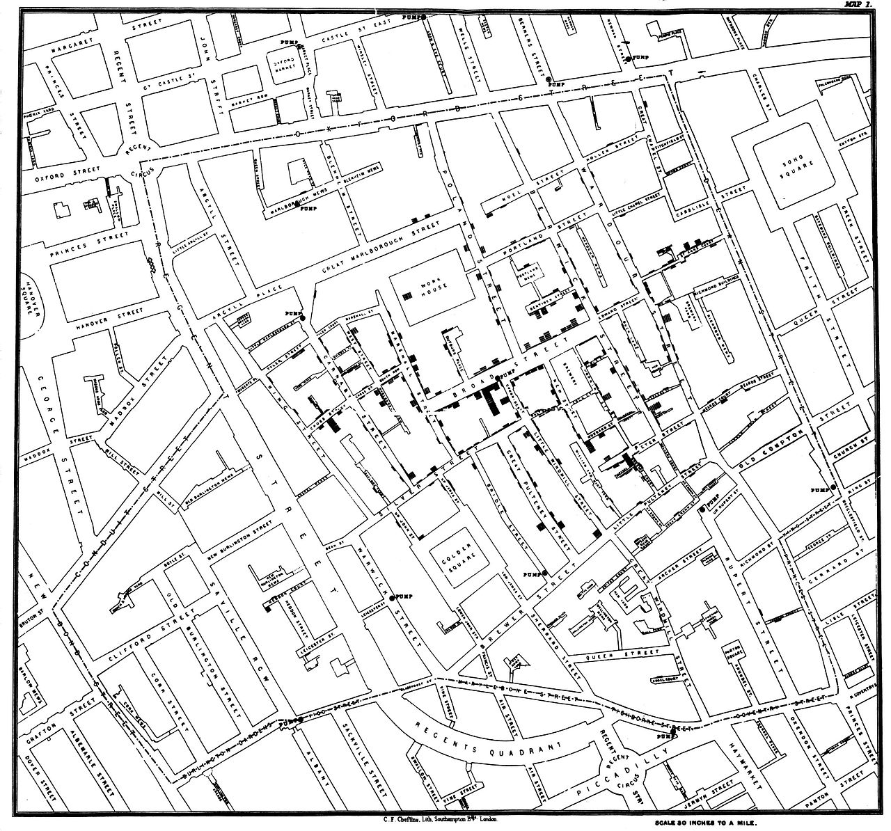
Figure 17.2: John Snow’s original map of the 1854 Broad Street cholera outbreak. Source: Wikipedia.
However, Snow’s insight was driven by another set of data—the locations of the street-side water pumps. It may be difficult to see in the reproduction, but in addition to the lines indicating cholera deaths, there are labeled circles indicating the water pumps. A quick study of the map reveals that nearly all of the cholera cases are clustered around a single pump on the center of Broad Street. Snow was able to convince local officials that this pump was the probable cause of the epidemic.
While the story presented here is factual, it may be more legend than spatial data analysts would like to believe. Much of the causality is dubious: Snow himself believed that the outbreak petered out more or less on its own, and he did not create his famous map until afterwards. Nevertheless, his map was influential in the realization among doctors that cholera is a waterborne—rather than airborne—disease.
Our idealized conception of Snow’s use of spatial analysis typifies a successful episode in data science. First, the key insight was made by combining three sources of data: the cholera deaths, the locations of the water pumps, and the London street map. Second, while we now have the capability to create a spatial model directly from the data that might have led to the same conclusion, constructing such a model is considerably more difficult than simply plotting the data in the proper context. Moreover, the plot itself—properly contextualized—is probably more convincing to most people than a statistical model anyway. Human beings have a very strong intuitive ability to see spatial patterns in data, but computers have no such sense. Third, the problem was only resolved when the data-based evidence was combined with a plausible model that explained the physical phenomenon. That is, Snow was a doctor and his knowledge of disease transmission was sufficient to convince his colleagues that cholera was not transmitted via the air.31
17.2 Spatial data structures
Spatial data are often stored in special data structures (i.e., not just data.frames). The most commonly used format for spatial data is called a shapefile.
Another common format is KML.
There are many other formats, and while mastering the details of any of these formats is not realistic in this treatment, there are some important basic notions that one must have in order to work with spatial data.
Shapefiles evolved as the native file format of the ArcView program developed by the Environmental Systems Research Institute (Esri) and have since become an open specification. They can be downloaded from many different government websites and other locations that publish spatial data. Spatial data consists not of rows and columns, but of geometric objects like points, lines, and polygons. Shapefiles contain vector-based instructions for drawing the boundaries of countries, counties, and towns, etc. As such, shapefiles are richer—and more complicated—data containers than simple data frames. Working with shapefiles in R can be challenging, but the major benefit is that shapefiles allow you to provide your data with a geographic context. The results can be stunning.
First, the term “shapefile” is somewhat of a misnomer, as there are several files that you must have in order to read spatial data.
These files have extensions like .shp, .shx, and .dbf, and they are typically stored in a common directory.
There are many packages for R that specialize in working with spatial data, but we will focus on the most recent: sf. This package provides a tidyverse-friendly set of class definitions and functions for spatial objects in R. These will have the class sf. (Under the hood, sf wraps functionality previously provided by the rgdal and rgeos packages.32)
To get a sense of how these work, we will make a recreation of Snow’s cholera map. First, download and unzip this file: (http://rtwilson.com/downloads/SnowGIS_SHP.zip). After loading the sf package, we explore the directory that contains our shapefiles.
library(sf)
# The correct path on your computer may be different
dsn <- fs::path(root, "snow", "SnowGIS_SHP")
list.files(dsn) [1] "Cholera_Deaths.dbf" "Cholera_Deaths.prj"
[3] "Cholera_Deaths.sbn" "Cholera_Deaths.sbx"
[5] "Cholera_Deaths.shp" "Cholera_Deaths.shx"
[7] "OSMap_Grayscale.tfw" "OSMap_Grayscale.tif"
[9] "OSMap_Grayscale.tif.aux.xml" "OSMap_Grayscale.tif.ovr"
[11] "OSMap.tfw" "OSMap.tif"
[13] "Pumps.dbf" "Pumps.prj"
[15] "Pumps.sbx" "Pumps.shp"
[17] "Pumps.shx" "README.txt"
[19] "SnowMap.tfw" "SnowMap.tif"
[21] "SnowMap.tif.aux.xml" "SnowMap.tif.ovr"
Note that there are six files with the name Cholera_Deaths and another five with the name Pumps. These correspond to two different sets of shapefiles called layers, as revealed by the st_layers() function.
st_layers(dsn)Driver: ESRI Shapefile
Available layers:
layer_name geometry_type features fields
1 Pumps Point 8 1
2 Cholera_Deaths Point 250 2We’ll begin by loading the Cholera_Deaths layer into R using the st_read() function. Note that Cholera_Deaths is a data.frame in addition to being an sf object. It contains 250 simple features – these are the rows of the data frame, each corresponding to a different spatial object. In this case, the geometry type is POINT for all 250 rows. We will return to discussion of the mysterious projected CRS in Section 17.3.2, but for now simply note that a specific geographic projection is encoded in these files.
CholeraDeaths <- st_read(dsn, layer = "Cholera_Deaths")Reading layer `Cholera_Deaths' from data source
`/home/bbaumer/Dropbox/git/mdsr-book/mdsr2e/data/shp/snow/SnowGIS_SHP'
using driver `ESRI Shapefile'
Simple feature collection with 250 features and 2 fields
Geometry type: POINT
Dimension: XY
Bounding box: xmin: 529000 ymin: 181000 xmax: 530000 ymax: 181000
Projected CRS: OSGB 1936 / British National Gridclass(CholeraDeaths)[1] "sf" "data.frame"CholeraDeathsSimple feature collection with 250 features and 2 fields
Geometry type: POINT
Dimension: XY
Bounding box: xmin: 529000 ymin: 181000 xmax: 530000 ymax: 181000
Projected CRS: OSGB 1936 / British National Grid
First 10 features:
Id Count geometry
1 0 3 POINT (529309 181031)
2 0 2 POINT (529312 181025)
3 0 1 POINT (529314 181020)
4 0 1 POINT (529317 181014)
5 0 4 POINT (529321 181008)
6 0 2 POINT (529337 181006)
7 0 2 POINT (529290 181024)
8 0 2 POINT (529301 181021)
9 0 3 POINT (529285 181020)
10 0 2 POINT (529288 181032)There are data associated with each of these points.
Every sf object is also a data.frame that stores values that correspond to each observation.
In this case, for each of the points, we have an associated Id number and a Count of the number of deaths at that location. To plot these data, we can simply use the plot() generic function as we did in Figure 17.1. However, in the next section, we will illustrate how sf objects can be integrated into a ggplot2 workflow.
17.3 Making maps
In addition to providing geospatial processing capabilities, sf also provides spatial plotting extensions that work seamlessly with ggplot2. The geom_sf() function extends the grammar of graphics embedded in ggplot2 that we explored in Chapter 3 to provide native support for plotting spatial objects. Thus, we are only a few steps away from having some powerful mapping functionality.
17.3.1 Static maps
The geom_sf() function allows you to plot geospatial objects in any ggplot2 object. Since the \(x\) and \(y\) coordinates are implied by the geometry of the sf object, you don’t have to explicitly bind the \(x\) aesthetic (see Chapter 3) to the longitudinal coordinate and the \(y\) aesthetic to the latitude. Your map looks like this:
ggplot(CholeraDeaths) +
geom_sf()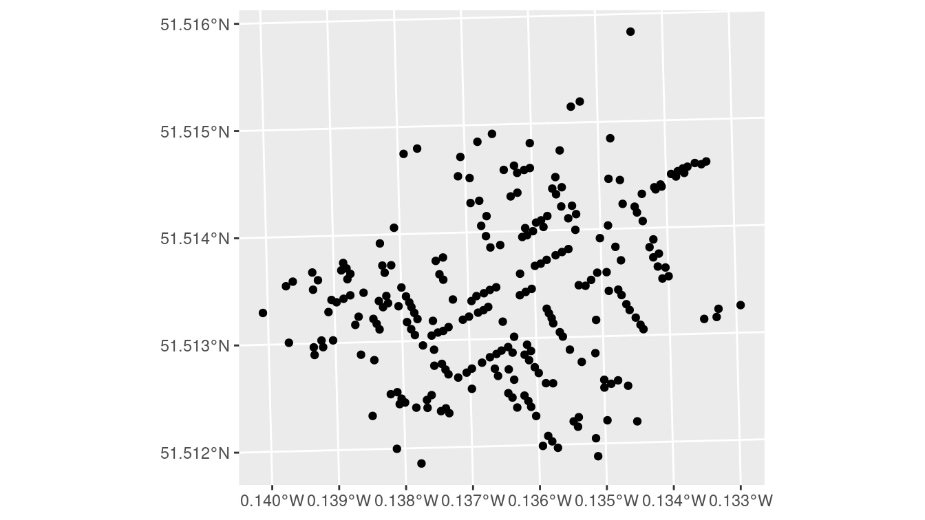
Figure 17.3: A simple ggplot2 of the cholera deaths, with little context provided.
Figure 17.3 is an improvement over what you would get from plot(). It is mostly clear what the coordinates along the axes are telling us (the units are in fact degrees), but we still don’t have any context for what we are seeing. What we really want is to overlay these points on the London street map—and this is exactly what ggspatial lets us do.
The annotation_map_tile() function adds a layer of map tiles pulled from Open Street Map. We can control the zoom level, as well as the type.
Here, we also map the number of deaths at each location to the size of the dot.
library(ggspatial)
ggplot(CholeraDeaths) +
annotation_map_tile(type = "osm", zoomin = 0) +
geom_sf(aes(size = Count), alpha = 0.7)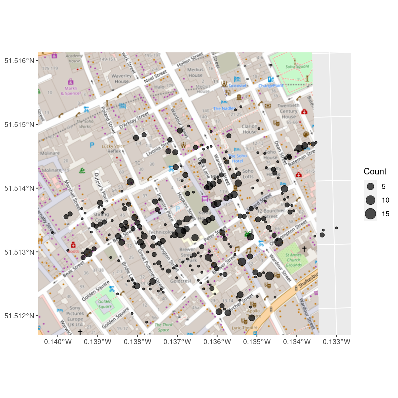
Figure 17.4: Erroneous reproduction of John Snow’s original map of the 1854 cholera outbreak. The dots representing the deaths from cholera are off by hundreds of meters.
We note that John Snow is now the name of a pub on the corner of Broadwick (formerly Broad) Street and Lexington Street.
But look carefully at Figure 17.4 and Figure 17.2. You will not see the points in the right places. The center of the cluster is not on Broadwick Street, and some of the points are in the middle of the street (where there are no residences). Why?
The coordinates in the CholeraDeaths object have unfamiliar values, as we can see by accessing the bounding box of the object.
st_bbox(CholeraDeaths) xmin ymin xmax ymax
529160 180858 529656 181306
Both CholeraDeaths and the map tiles retrieved by the ggspatial package have geospatial coordinates, but those coordinates are not in the same units.
While it is true that annotation_map_tile() performs some on the fly coordination translation, there remains a discrepancy between our two geospatial data sources.
To understand how to get these two spatial data sources to work together properly, we have to understand projections.
17.3.2 Projections
The Earth happens to be an oblate spheroid—a three-dimensional flattened sphere. Yet we would like to create two-dimensional representations of the Earth that fit on pages or computer screens. The process of converting locations in a three-dimensional geographic coordinate system to a two-dimensional representation is called projection.
Once people figured out that the world was not flat, the question of how to project it followed. Since people have been making nautical maps for centuries, it would be nice if the study of map projection had resulted in a simple, accurate, universally-accepted projection system. Unfortunately, that is not the case. It is simply not possible to faithfully preserve all properties present in a three-dimensional space in a two-dimensional space. Thus there is no one best projection system—each has its own advantages and disadvantages. As noted previously, because the Earth is not a perfect sphere the mathematics behind many of these projections are non-trivial.
Two properties that a projection system might preserve—though not simultaneously—are shape/angle and area. That is, a projection system may be constructed in such a way that it faithfully represents the relative sizes of land masses in two dimensions. The Mercator projection shown at left in Figure 17.5 is a famous example of a projection system that does not preserve area. Its popularity is a result of its angle-preserving nature, which makes it useful for navigation. Unfortunately, it greatly distorts the size of features near the poles, where land masses become infinitely large.
library(mapproj)
library(maps)
map("world", projection = "mercator", wrap = TRUE)
map("world", projection = "cylequalarea", param = 45, wrap = TRUE)
Figure 17.5: The world according to the Mercator (left) and Gall–Peters (right) projections.
The Gall–Peters projection shown at right in Figure 17.5 does preserve area. Note the difference between the two projections when comparing the size of Greenland to Africa. In reality (as shown in the Gall–Peters projection) Africa is 14 times larger than Greenland. However, because Greenland is much closer to the North Pole, its area is greatly distorted in the Mercator projection, making it appear to be larger than Africa.
This particular example—while illustrative—became famous because of the socio-political controversy in which these projections became embroiled. Beginning in the 1960s, a German filmmaker named Arno Peters alleged that the commonly-used Mercator projection was an instrument of cartographic imperialism, in that it falsely focused attention on Northern and Southern countries at the expense of those in Africa and South America closer to the equator. Peters had a point—the Mercator projection has many shortcomings—but unfortunately his claims about the virtues of the Gall–Peters projection (particularly its originality) were mostly false. Peters either ignored or was not aware that cartographers had long campaigned against the Mercator.
Nevertheless, you should be aware that the “default” projection can be very misleading. As a data scientist, your choice of how to project your data can have a direct influence on what viewers will take away from your data maps. Simply ignoring the implications of projections is not an ethically tenable position! While we can’t offer a comprehensive list of map projections here, two common general-purpose map projections are the Lambert conformal conic projection and the Albers equal-area conic projection (see Figure 17.6). In the former, angles are preserved, while in the latter neither scale nor shape are preserved, but gross distortions of both are minimized.
map(
"state", projection = "lambert",
parameters = c(lat0 = 20, lat1 = 50), wrap = TRUE
)
map(
"state", projection = "albers",
parameters = c(lat0 = 20, lat1 = 50), wrap = TRUE
)
Figure 17.6: The contiguous United States according to the Lambert conformal conic (left) and Albers equal area (right) projections. We have specified that the scales are true on the 20th and 50th parallels.
Always think about how your data are projected when making a map.
A coordinate reference system (CRS) is needed to keep track of geographic locations. Every spatially-aware object in R can have a projection. Three formats that are common for storing information about the projection of a geospatial object are EPSG, PROJ.4, and WKT. The former is simply an integer, while PROJ.4 is a cryptic string of text. The latter can be retrieved (or set) using the st_crs() command.
st_crs(CholeraDeaths)Coordinate Reference System:
User input: OSGB 1936 / British National Grid
wkt:
PROJCRS["OSGB 1936 / British National Grid",
BASEGEOGCRS["OSGB 1936",
DATUM["OSGB 1936",
ELLIPSOID["Airy 1830",6377563.396,299.3249646,
LENGTHUNIT["metre",1]]],
PRIMEM["Greenwich",0,
ANGLEUNIT["degree",0.0174532925199433]],
ID["EPSG",4277]],
CONVERSION["British National Grid",
METHOD["Transverse Mercator",
ID["EPSG",9807]],
PARAMETER["Latitude of natural origin",49,
ANGLEUNIT["degree",0.0174532925199433],
ID["EPSG",8801]],
PARAMETER["Longitude of natural origin",-2,
ANGLEUNIT["degree",0.0174532925199433],
ID["EPSG",8802]],
PARAMETER["Scale factor at natural origin",0.9996012717,
SCALEUNIT["unity",1],
ID["EPSG",8805]],
PARAMETER["False easting",400000,
LENGTHUNIT["metre",1],
ID["EPSG",8806]],
PARAMETER["False northing",-100000,
LENGTHUNIT["metre",1],
ID["EPSG",8807]]],
CS[Cartesian,2],
AXIS["(E)",east,
ORDER[1],
LENGTHUNIT["metre",1]],
AXIS["(N)",north,
ORDER[2],
LENGTHUNIT["metre",1]],
USAGE[
SCOPE["unknown"],
AREA["UK - Britain and UKCS 49°46'N to 61°01'N, 7°33'W to 3°33'E"],
BBOX[49.75,-9.2,61.14,2.88]],
ID["EPSG",27700]]It should be clear by now that the science of map projection is complicated, and it is likely unclear how to decipher this representation of the projection, which is in a format called Well-Known Text. What we can say is that METHOD["Transverse_Mercator"] indicates that these data are encoded using a Transverse Mercator projection. The Airy ellipsoid is being used, and the units are meters.
The equivalent EPSG system is 27700.
The datum—or model of the Earth—is OSGB 1936, which is also known as the British National Grid.
The rest of the terms in the string are parameters that specify properties of that projection. The unfamiliar coordinates that we saw earlier for the CholeraDeaths data set were relative to this CRS.
There are many CRSs, but a few are most common. A set of EPSG (European Petroleum Survey Group) codes provides a shorthand for the full descriptions (like the one shown above). The most commonly-used are:
- EPSG:4326 - Also known as WGS84, this is the standard for GPS systems and Google Earth.
- EPSG:3857 - A Mercator projection used in maps tiles33 by Google Maps, Open Street Maps, etc.
- EPSG:27700 - Also known as OSGB 1936, or the British National Grid: United Kingdom Ordnance Survey. It is commonly used in Britain.
The st_crs() function will translate from the shorthand EPSG code to the full-text PROJ.4 strings and WKT.
st_crs(4326)$epsg[1] 4326st_crs(3857)$Wkt[1] "PROJCS[\"WGS 84 / Pseudo-Mercator\",GEOGCS[\"WGS 84\",DATUM[\"WGS_1984\",SPHEROID[\"WGS 84\",6378137,298.257223563,AUTHORITY[\"EPSG\",\"7030\"]],AUTHORITY[\"EPSG\",\"6326\"]],PRIMEM[\"Greenwich\",0,AUTHORITY[\"EPSG\",\"8901\"]],UNIT[\"degree\",0.0174532925199433,AUTHORITY[\"EPSG\",\"9122\"]],AUTHORITY[\"EPSG\",\"4326\"]],PROJECTION[\"Mercator_1SP\"],PARAMETER[\"central_meridian\",0],PARAMETER[\"scale_factor\",1],PARAMETER[\"false_easting\",0],PARAMETER[\"false_northing\",0],UNIT[\"metre\",1,AUTHORITY[\"EPSG\",\"9001\"]],AXIS[\"Easting\",EAST],AXIS[\"Northing\",NORTH],EXTENSION[\"PROJ4\",\"+proj=merc +a=6378137 +b=6378137 +lat_ts=0 +lon_0=0 +x_0=0 +y_0=0 +k=1 +units=m +nadgrids=@null +wktext +no_defs\"],AUTHORITY[\"EPSG\",\"3857\"]]"st_crs(27700)$proj4string[1] "+proj=tmerc +lat_0=49 +lon_0=-2 +k=0.9996012717 +x_0=400000 +y_0=-100000 +ellps=airy +units=m +no_defs"
The CholeraDeaths points did not show up on our earlier map because we did not project them into the same coordinate system as the map tiles. Since we can’t project the map tiles, we had better project the points in the CholeraDeaths data. As noted above, Google Maps tiles (and Open Street Map tiles) are projected in the espg:3857 system. However, they are confusingly returned with coordinates in the epsg:4326 system. Thus, we use the st_transform() function to project our CholeraDeaths data to epsg:4326.
cholera_4326 <- CholeraDeaths %>%
st_transform(4326)Note that the bounding box in our new coordinates are in the same familiar units of latitude and longitude.
st_bbox(cholera_4326) xmin ymin xmax ymax
-0.140 51.512 -0.133 51.516 Unfortunately, the code below still produces a map with the points in the wrong places.
ggplot(cholera_4326) +
annotation_map_tile(type = "osm", zoomin = 0) +
geom_sf(aes(size = Count), alpha = 0.7)A careful reading of the help file for spTransform-methods() (the underlying machinery) gives some clues to our mistake.
help("spTransform-methods", package = "rgdal")
Not providing the appropriate
+datumand+towgs84tags may lead to coordinates being out by hundreds of meters. Unfortunately, there is no easy way to provide this information: The user has to know the correct metadata for the data being used, even if this can be hard to discover.
That seems like our problem!
The +datum and +towgs84 arguments were missing from our PROJ.4 string.
st_crs(CholeraDeaths)$proj4string[1] "+proj=tmerc +lat_0=49 +lon_0=-2 +k=0.9996012717 +x_0=400000 +y_0=-100000 +ellps=airy +units=m +no_defs"The CholeraDeaths object has all of the same specifications as epsg:27700 but without the missing +datum and +towgs84 tags. Furthermore, the documentation for the original data source suggests using epsg:27700. Thus, we first assert that the CholeraDeaths data is in epsg:27700.
Then, projecting to epsg:4326 works as intended.
cholera_latlong <- CholeraDeaths %>%
st_set_crs(27700) %>%
st_transform(4326)
snow <- ggplot(cholera_latlong) +
annotation_map_tile(type = "osm", zoomin = 0) +
geom_sf(aes(size = Count))All that remains is to add the locations of the pumps.
pumps <- st_read(dsn, layer = "Pumps")Reading layer `Pumps' from data source
`/home/bbaumer/Dropbox/git/mdsr-book/mdsr2e/data/shp/snow/SnowGIS_SHP'
using driver `ESRI Shapefile'
Simple feature collection with 8 features and 1 field
Geometry type: POINT
Dimension: XY
Bounding box: xmin: 529000 ymin: 181000 xmax: 530000 ymax: 181000
Projected CRS: OSGB 1936 / British National Gridpumps_latlong <- pumps %>%
st_set_crs(27700) %>%
st_transform(4326)
snow +
geom_sf(data = pumps_latlong, size = 3, color = "red")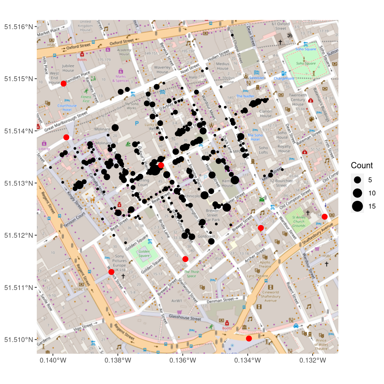
Figure 17.7: Recreation of John Snow’s original map of the 1854 cholera outbreak. The size of each black dot is proportional to the number of people who died from cholera at that location. The red dots indicate the location of public water pumps. The strong clustering of deaths around the water pump on Broad(wick) Street suggests that perhaps the cholera was spread through water obtained at that pump.
In Figure 17.7, we finally see the clarity that judicious uses of spatial data in the proper context can provide. It is not necessary to fit a statistical model to these data to see that nearly all of the cholera deaths occurred in people closest to the Broad Street water pump, which was later found to be drawing fecal bacteria from a nearby cesspit.
17.3.3 Dynamic maps with leaflet
Leaflet is a powerful open-source JavaScript library for building interactive maps in HTML. The corresponding R package leaflet brings this functionality to R using the htmlwidgets platform introduced in Chapter 14.
Although the commands are different, the architecture is very similar to ggplot2. However, instead of putting data-based layers on top of a static map, leaflet allows you to put data-based layers on top of an interactive map.
Because leaflet renders as HTML, you won’t be able to take advantage of our plots in the printed book (since they are displayed as screen shots). We encourage you to run this code on your own and explore interactively.
A leaflet map widget is created with the leaflet() command. We will subsequently add layers to this widget. The first layer that we will add is a tile layer containing all of the static map information, which by default comes from OpenStreetMap. The second layer we will add here is a marker, which designates a point location. Note how the addMarkers() function can take a data argument, just like a geom_*() layer in ggplot2 would.
white_house <- tibble(
address = "The White House, Washington, DC"
) %>%
tidygeocoder::geocode(address, method = "osm")
library(leaflet)
white_house_map <- leaflet() %>%
addTiles() %>%
addMarkers(data = white_house)
white_house_mapFigure 17.8: A leaflet plot of the White House.
When you render this in RStudio, or in an R Markdown document with HTML output, or in a Web browser using Shiny, you will be able to scroll and zoom on the fly. In Figure 17.8 we display our version.
We can also add a pop-up to provide more information about a particular location, as shown in Figure 17.9.
white_house <- white_house %>%
mutate(
title = "The White House",
street_address = "1600 Pennsylvania Ave"
)
white_house_map %>%
addPopups(
data = white_house,
popup = ~paste0("<b>", title, "</b></br>", street_address)
)Figure 17.9: A leaflet plot of the White House with a popup.
Although leaflet and ggplot2 are not syntactically equivalent, they are conceptually similar. Because the map tiles provide geographic context, the dynamic, zoomable, scrollable maps created by leaflet can be more informative than the static maps created by ggplot2.
17.4 Extended example: Congressional districts
In the 2012 presidential election, the Republican challenger Mitt Romney narrowly defeated President Barack Obama in the state of North Carolina, winning 50.4% of the popular votes, and thereby earning all 15 electoral votes. Obama had won North Carolina in 2008—becoming the first Democrat to do so since 1976. As a swing state, North Carolina has voting patterns that are particularly interesting, and—as we will see—contentious.
The roughly 50/50 split in the popular vote suggests that there are about the same number of Democratic and Republican voters in the state. In the fall of 2020, 10 of North Carolina’s 13 congressional representatives are Republican (with one seat currently vacant). How can this be? In this case, geospatial data can help us understand.
17.4.1 Election results
Our first step is to download the results of the 2012 congressional elections from the Federal Election Commission. These data are available through the fec12 package.34
library(fec12)Note that we have slightly more than 435 elections, since these data include U.S. territories like Puerto Rico and the Virgin Islands.
results_house %>%
group_by(state, district_id) %>%
summarize(N = n()) %>%
nrow()[1] 445According to the United States Constitution, congressional districts are apportioned according to population from the 2010 U.S. Census. In practice, we see that this is not quite the case. These are the 10 candidates who earned the most votes in the general election.
results_house %>%
left_join(candidates, by = "cand_id") %>%
select(state, district_id, cand_name, party, general_votes) %>%
arrange(desc(general_votes))# A tibble: 2,343 × 5
state district_id cand_name party general_votes
<chr> <chr> <chr> <chr> <dbl>
1 PR 00 PIERLUISI, PEDRO R NPP 905066
2 PR 00 ALOMAR, RAFAEL COX PPD 881181
3 PA 02 FATTAH, CHAKA MR. D 318176
4 WA 07 MCDERMOTT, JAMES D 298368
5 MI 14 PETERS, GARY D 270450
6 MO 01 CLAY, WILLIAM LACY JR D 267927
7 WI 02 POCAN, MARK D 265422
8 OR 03 BLUMENAUER, EARL D 264979
9 MA 08 LYNCH, STEPHEN F D 263999
10 MN 05 ELLISON, KEITH MAURICE DFL 262102
# … with 2,333 more rows
Note that the representatives from Puerto Rico earned nearly three times as many votes as any other Congressional representative.
We are interested in the results from North Carolina.
We begin by creating a data frame specific to that state, with the votes aggregated by congressional district.
As there are 13 districts, the nc_results data frame will have exactly 13 rows.
district_elections <- results_house %>%
mutate(district = parse_number(district_id)) %>%
group_by(state, district) %>%
summarize(
N = n(),
total_votes = sum(general_votes, na.rm = TRUE),
d_votes = sum(ifelse(party == "D", general_votes, 0), na.rm = TRUE),
r_votes = sum(ifelse(party == "R", general_votes, 0), na.rm = TRUE)
) %>%
mutate(
other_votes = total_votes - d_votes - r_votes,
r_prop = r_votes / total_votes,
winner = ifelse(r_votes > d_votes, "Republican", "Democrat")
)
nc_results <- district_elections %>%
filter(state == "NC")
nc_results %>%
select(-state)Adding missing grouping variables: `state`# A tibble: 13 × 9
# Groups: state [1]
state district N total_votes d_votes r_votes other_votes r_prop
<chr> <dbl> <int> <dbl> <dbl> <dbl> <dbl> <dbl>
1 NC 1 4 338066 254644 77288 6134 0.229
2 NC 2 8 311397 128973 174066 8358 0.559
3 NC 3 3 309885 114314 195571 0 0.631
4 NC 4 4 348485 259534 88951 0 0.255
5 NC 5 3 349197 148252 200945 0 0.575
6 NC 6 4 364583 142467 222116 0 0.609
7 NC 7 4 336736 168695 168041 0 0.499
8 NC 8 8 301824 137139 160695 3990 0.532
9 NC 9 13 375690 171503 194537 9650 0.518
10 NC 10 6 334849 144023 190826 0 0.570
11 NC 11 11 331426 141107 190319 0 0.574
12 NC 12 3 310908 247591 63317 0 0.204
13 NC 13 5 370610 160115 210495 0 0.568
# … with 1 more variable: winner <chr>We see that the distribution of the number of votes cast across congressional districts in North Carolina is very narrow—all of the districts had between 301,824 and 375,690 votes cast.
nc_results %>%
skim(total_votes) %>%
select(-na)
── Variable type: numeric ──────────────────────────────────────────────────
var state n mean sd p0 p25 p50 p75 p100
<chr> <chr> <int> <dbl> <dbl> <dbl> <dbl> <dbl> <dbl> <dbl>
1 total_votes NC 13 337204. 24175. 301824 311397 336736 349197 375690However, as the close presidential election suggests, the votes of North Carolinans were roughly evenly divided among Democratic and Republican congressional candidates. In fact, state Democrats earned a narrow majority—50.6%—of the votes. Yet the Republicans won 9 of the 13 races.35
nc_results %>%
summarize(
N = n(),
state_votes = sum(total_votes),
state_d = sum(d_votes),
state_r = sum(r_votes)
) %>%
mutate(
d_prop = state_d / state_votes,
r_prop = state_r / state_votes
)# A tibble: 1 × 7
state N state_votes state_d state_r d_prop r_prop
<chr> <int> <dbl> <dbl> <dbl> <dbl> <dbl>
1 NC 13 4383656 2218357 2137167 0.506 0.488One clue is to look more closely at the distribution of the proportion of Republican votes in each district.
nc_results %>%
select(district, r_prop, winner) %>%
arrange(desc(r_prop))# A tibble: 13 × 4
# Groups: state [1]
state district r_prop winner
<chr> <dbl> <dbl> <chr>
1 NC 3 0.631 Republican
2 NC 6 0.609 Republican
3 NC 5 0.575 Republican
4 NC 11 0.574 Republican
5 NC 10 0.570 Republican
6 NC 13 0.568 Republican
7 NC 2 0.559 Republican
8 NC 8 0.532 Republican
9 NC 9 0.518 Republican
10 NC 7 0.499 Democrat
11 NC 4 0.255 Democrat
12 NC 1 0.229 Democrat
13 NC 12 0.204 Democrat In the nine districts that Republicans won, their share of the vote ranged from a narrow (51.8%) to a comfortable (63.1%) majority. With the exception of the essentially even 7th district, the three districts that Democrats won were routs, with the Democratic candidate winning between 75% and 80% of the vote. Thus, although Democrats won more votes across the state, most of their votes were clustered within three overwhelmingly Democratic districts, allowing Republicans to prevail with moderate majorities across the remaining nine districts.
Conventional wisdom states that Democratic voters tend to live in cities, so perhaps they were simply clustered in three cities, while Republican voters were spread out across the state in more rural areas. Let’s look more closely at the districts.
17.4.2 Congressional districts
To do this, we first download the congressional district shapefiles for the 113th Congress.
src <- "http://cdmaps.polisci.ucla.edu/shp/districts113.zip"
dsn_districts <- usethis::use_zip(src, destdir = fs::path("data_large"))Next, we read these shapefiles into R as an sf object.
library(sf)
st_layers(dsn_districts)Driver: ESRI Shapefile
Available layers:
layer_name geometry_type features fields
1 districts113 Polygon 436 15districts <- st_read(dsn_districts, layer = "districts113") %>%
mutate(DISTRICT = parse_number(as.character(DISTRICT)))Reading layer `districts113' from data source
`/home/bbaumer/Dropbox/git/mdsr-book/mdsr2e/data_large/districtShapes'
using driver `ESRI Shapefile'
Simple feature collection with 436 features and 15 fields (with 1 geometry empty)
Geometry type: MULTIPOLYGON
Dimension: XY
Bounding box: xmin: -179 ymin: 18.9 xmax: 180 ymax: 71.4
Geodetic CRS: NAD83glimpse(districts)Rows: 436
Columns: 16
$ STATENAME <chr> "Louisiana", "Maine", "Maine", "Maryland", "Maryland", …
$ ID <chr> "022113114006", "023113114001", "023113114002", "024113…
$ DISTRICT <dbl> 6, 1, 2, 1, 2, 3, 4, 5, 6, 7, 8, 1, 2, 3, 4, 5, 6, 7, 8…
$ STARTCONG <chr> "113", "113", "113", "113", "113", "113", "113", "113",…
$ ENDCONG <chr> "114", "114", "114", "114", "114", "114", "114", "114",…
$ DISTRICTSI <chr> NA, NA, NA, NA, NA, NA, NA, NA, NA, NA, NA, NA, NA, NA,…
$ COUNTY <chr> NA, NA, NA, NA, NA, NA, NA, NA, NA, NA, NA, NA, NA, NA,…
$ PAGE <chr> NA, NA, NA, NA, NA, NA, NA, NA, NA, NA, NA, NA, NA, NA,…
$ LAW <chr> NA, NA, NA, NA, NA, NA, NA, NA, NA, NA, NA, NA, NA, NA,…
$ NOTE <chr> NA, NA, NA, NA, NA, NA, NA, NA, NA, NA, NA, NA, NA, NA,…
$ BESTDEC <chr> NA, NA, NA, NA, NA, NA, NA, NA, NA, NA, NA, NA, NA, NA,…
$ FINALNOTE <chr> "{\"From US Census website\"}", "{\"From US Census webs…
$ RNOTE <chr> NA, NA, NA, NA, NA, NA, NA, NA, NA, NA, NA, NA, NA, NA,…
$ LASTCHANGE <chr> "2016-05-29 16:44:10.857626", "2016-05-29 16:44:10.8576…
$ FROMCOUNTY <chr> "F", "F", "F", "F", "F", "F", "F", "F", "F", "F", "F", …
$ geometry <MULTIPOLYGON [°]> MULTIPOLYGON (((-91.8 30.9,..., MULTIPOLYG…We are investigating North Carolina, so we will create a smaller object with only those shapes using the filter() function. Note that since every sf object is also a data.frame, we can use all of our usual dplyr tools on our geospatial objects.
nc_shp <- districts %>%
filter(STATENAME == "North Carolina")
nc_shp %>%
st_geometry() %>%
plot(col = gray.colors(nrow(nc_shp)))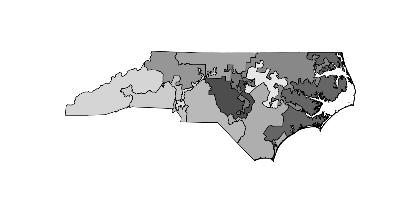
Figure 17.10: A basic map of the North Carolina congressional districts.
It is hard to see exactly what is going on here, but it appears as though there are some traditionally shaped districts, as well as some very strange and narrow districts. Unfortunately the map in Figure 17.10 is devoid of context, so it is not very informative.
We need the nc_results data to provide that context.
17.4.3 Putting it all together
How to merge these two together? The simplest way is to use the inner_join() function from dplyr (see Chapter 5).
Since both nc_shp and nc_results are data.frames, this will append the election results data to the geospatial data.
Here, we merge the nc_shp polygons with the nc_results election data frame using the district as the key.
Note that there are 13 polygons and 13 rows.
nc_merged <- nc_shp %>%
st_transform(4326) %>%
inner_join(nc_results, by = c("DISTRICT" = "district"))
glimpse(nc_merged)Rows: 13
Columns: 24
$ STATENAME <chr> "North Carolina", "North Carolina", "North Carolina", …
$ ID <chr> "037113114002", "037113114003", "037113114004", "03711…
$ DISTRICT <dbl> 2, 3, 4, 1, 5, 6, 7, 8, 9, 10, 11, 12, 13
$ STARTCONG <chr> "113", "113", "113", "113", "113", "113", "113", "113"…
$ ENDCONG <chr> "114", "114", "114", "114", "114", "114", "114", "114"…
$ DISTRICTSI <chr> NA, NA, NA, NA, NA, NA, NA, NA, NA, NA, NA, NA, NA
$ COUNTY <chr> NA, NA, NA, NA, NA, NA, NA, NA, NA, NA, NA, NA, NA
$ PAGE <chr> NA, NA, NA, NA, NA, NA, NA, NA, NA, NA, NA, NA, NA
$ LAW <chr> NA, NA, NA, NA, NA, NA, NA, NA, NA, NA, NA, NA, NA
$ NOTE <chr> NA, NA, NA, NA, NA, NA, NA, NA, NA, NA, NA, NA, NA
$ BESTDEC <chr> NA, NA, NA, NA, NA, NA, NA, NA, NA, NA, NA, NA, NA
$ FINALNOTE <chr> "{\"From US Census website\"}", "{\"From US Census web…
$ RNOTE <chr> NA, NA, NA, NA, NA, NA, NA, NA, NA, NA, NA, NA, NA
$ LASTCHANGE <chr> "2016-05-29 16:44:10.857626", "2016-05-29 16:44:10.857…
$ FROMCOUNTY <chr> "F", "F", "F", "F", "F", "F", "F", "F", "F", "F", "F",…
$ state <chr> "NC", "NC", "NC", "NC", "NC", "NC", "NC", "NC", "NC", …
$ N <int> 8, 3, 4, 4, 3, 4, 4, 8, 13, 6, 11, 3, 5
$ total_votes <dbl> 311397, 309885, 348485, 338066, 349197, 364583, 336736…
$ d_votes <dbl> 128973, 114314, 259534, 254644, 148252, 142467, 168695…
$ r_votes <dbl> 174066, 195571, 88951, 77288, 200945, 222116, 168041, …
$ other_votes <dbl> 8358, 0, 0, 6134, 0, 0, 0, 3990, 9650, 0, 0, 0, 0
$ r_prop <dbl> 0.559, 0.631, 0.255, 0.229, 0.575, 0.609, 0.499, 0.532…
$ winner <chr> "Republican", "Republican", "Democrat", "Democrat", "R…
$ geometry <MULTIPOLYGON [°]> MULTIPOLYGON (((-80.1 35.8,..., MULTIPOLYGON (((-78.3 …17.4.4 Using ggplot2
We are now ready to plot our map of North Carolina’s congressional districts. We start by using a simple red–blue color scheme for the districts.
nc <- ggplot(data = nc_merged, aes(fill = winner)) +
annotation_map_tile(zoom = 6, type = "osm") +
geom_sf(alpha = 0.5) +
scale_fill_manual("Winner", values = c("blue", "red")) +
geom_sf_label(aes(label = DISTRICT), fill = "white") +
theme_void()
nc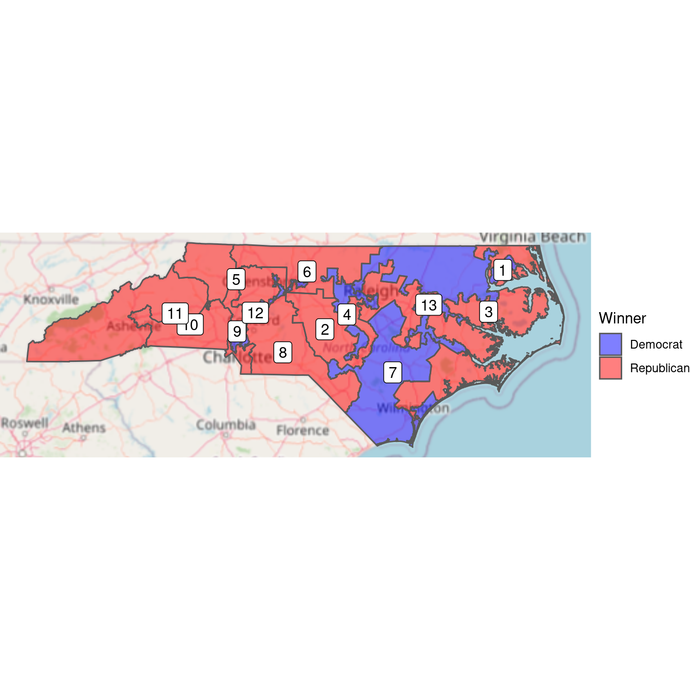
Figure 17.11: Bichromatic choropleth map of the results of the 2012 congressional elections in North Carolina.
Figure 17.11 shows that it was the Democratic districts that tended to be irregularly shaped. Districts 12 and 4 have narrow, tortured shapes—both were heavily Democratic. This plot tells us who won, but it doesn’t convey the subtleties we observed about the margins of victory. In the next plot, we use a continuous color scale to to indicate the proportion of votes in each district. The RdBu diverging color palette comes from RColorBrewer (see Chapter 2).
nc +
aes(fill = r_prop) +
scale_fill_distiller(
"Proportion\nRepublican",
palette = "RdBu",
limits = c(0.2, 0.8)
)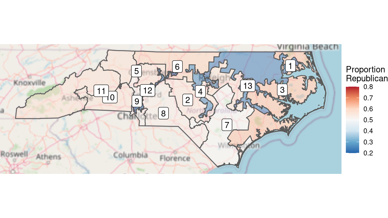
Figure 17.12: Full color choropleth map of the results of the 2012 congressional elections in North Carolina. The clustering of Democratic voters is evident from the deeper blue in Democratic districts, versus the pale red in the more numerous Republican districts.
The limits argument to scale_fill_distiller() is important. This forces red to be the color associated with 80% Republican votes and blue to be associated with 80% Democratic votes. Without this argument, red would be associated with the maximum value in that data (about 63%) and blue with the minimum (about 20%). This would result in the neutral color of white not being at exactly 50%. When choosing color scales, it is critically important to make choices that reflect the data.
Choose colors and scales carefully when making maps.
In Figure 17.12, we can see that the three Democratic districts are “bluer” than the nine Republican counties are “red.” This reflects the clustering that we observed earlier. North Carolina has become one of the more egregious examples of gerrymandering, the phenomenon of when legislators of one party use their re-districting power for political gain. This is evident in Figure 17.12, where Democratic votes are concentrated in three curiously-drawn congressional districts. This enables Republican lawmakers to have 69% (9/13) of the voting power in Congress despite earning only 48.8% of the votes.
Since the 1st edition of this book, the North Carolina gerrymandering case went all the way to the United States Supreme Court. In a landmark 2018 decision, the Justices ruled 5–4 in Rucho vs. Common Cause that while partisan gerrymanders such as those in North Carolina may be problematic for democracy, they are not reviewable by the judicial system.
17.4.5 Using leaflet
Was it true that the Democratic districts were weaved together to contain many of the biggest cities in the state? A similar map made in leaflet allows us to zoom in and pan out, making it easier to survey the districts.
First, we will define a color palette over the values \([0,1]\) that ranges from red to blue.
library(leaflet)
pal <- colorNumeric(palette = "RdBu", domain = c(0, 1))To make our plot in leaflet, we have to add the tiles, and then the polygons defined by the sf object nc_merged.
Since we want red to be associated with the proportion of Republican votes, we will map 1 - r_prop to color.
Note that we also add popups with the actual proportions, so that if you click on the map, it will show the district number and the proportion of Republican votes.
The resulting leaflet map is shown in Figure 17.13.
leaflet_nc <- leaflet(nc_merged) %>%
addTiles() %>%
addPolygons(
weight = 1, fillOpacity = 0.7,
color = ~pal(1 - r_prop),
popup = ~paste("District", DISTRICT, "</br>", round(r_prop, 4))
) %>%
setView(lng = -80, lat = 35, zoom = 7)Figure 17.13: A leaflet plot of the North Carolina congressional districts.
Indeed, the curiously-drawn districts in blue encompass all seven of the largest cities in the state: Charlotte, Raleigh, Greensboro, Durham, Winston-Salem, Fayetteville, and Cary.
17.5 Effective maps: How (not) to lie
The map shown in Figure 17.12 is an example of a choropleth map. This is a very common type of map where coloring and/or shading is used to differentiate a region of the map based on the value of a variable. These maps are popular, and can be very persuasive, but you should be aware of some challenges when making and interpreting choropleth maps and other data maps. Three common map types include:
- Choropleth: color or shade regions based on the value of a variable
- Proportional symbol: associate a symbol with each location, but scale its size to reflect the value of a variable
- Dot density: place dots for each data point, and view their accumulation
We note that in a proportional symbol map the symbol placed on the map is usually two-dimensional. Its size—in area—should be scaled in proportion to the quantity being mapped. Be aware that often the size of the symbol is defined by its radius. If the radius is in direct proportion to the quantity being mapped, then the area will be disproportionately large.
Always scale the size of proportional symbols in terms of their area.
As noted in Chapter 2, the choice of scale is also important and often done poorly. The relationship between various quantities can be altered by scale. In Chapter 2, we showed how the use of logarithmic scale can be used to improve the readability of a scatterplot. In Figure 17.12, we illustrated the importance of properly setting the scale of a proportion so that 0.5 was exactly in the middle. Try making Figure 17.12 without doing this and see if the results are as easily interpretable.
Decisions about colors are also crucial to making an effective map. In Chapter 2, we mentioned the color palettes available through RColorBrewer. When making maps, categorical variables should be displayed using a qualitative palette, while quantitative variables should be displayed using a sequential or diverging palette. In Figure 17.12 we employed a diverging palette, because Republicans and Democrats are on two opposite ends of the scale, with the neutral white color representing 0.5.
It’s important to decide how to deal with missing values. Leaving them a default color (e.g., white) might confuse them with observed values.
Finally, the concept of normalization is fundamental. Plotting raw data values on maps can easily distort the truth. This is particularly true in the case of data maps, because area is an implied variable. Thus, on choropleth maps, we almost always want to show some sort of density or ratio rather than raw values (i.e., counts).
17.6 Projecting polygons
It is worth briefly illustrating the hazards of mapping unprojected data. Consider the congressional district map for the entire country. To plot this, we follow the same steps as before, but omit the step of restricting to North Carolina. There is one additional step here for creating a mapping between state names and their abbreviations. Thankfully, these data are built into R.
districts_full <- districts %>%
left_join(
tibble(state.abb, state.name),
by = c("STATENAME" = "state.name")
) %>%
left_join(
district_elections,
by = c("state.abb" = "state", "DISTRICT" = "district")
)We can make the map by adding white polygons for the generic map data and then adding colored polygons for each congressional district. Some clipping will make this easier to see.
box <- st_bbox(districts_full)
world <- map_data("world") %>%
st_as_sf(coords = c("long", "lat")) %>%
group_by(group) %>%
summarize(region = first(region), do_union = FALSE) %>%
st_cast("POLYGON") %>%
st_set_crs(4269)We display the Mercator projection of this base map in Figure 17.14. Note how massive Alaska appears to be in relation to the other states. Alaska is big, but it is not that big! This is a distortion of reality due to the projection.
map_4269 <- ggplot(data = districts_full) +
geom_sf(data = world, size = 0.1) +
geom_sf(aes(fill = r_prop), size = 0.1) +
scale_fill_distiller(palette = "RdBu", limits = c(0, 1)) +
theme_void() +
labs(fill = "Proportion\nRepublican") +
xlim(-180, -50) + ylim(box[c("ymin", "ymax")])
map_4269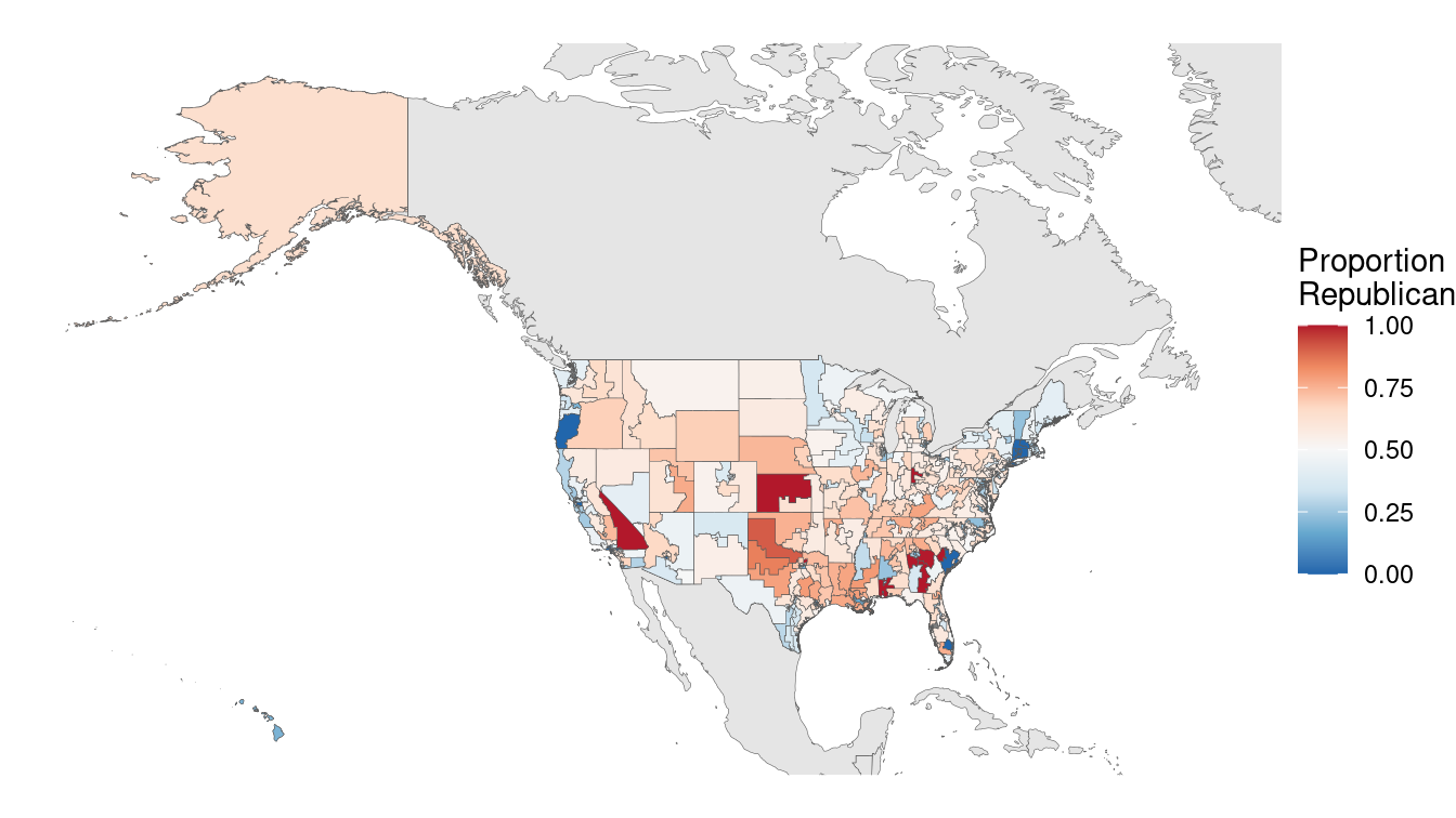
Figure 17.14: U.S. congressional election results, 2012 (Mercator projection).
We can use the Albers equal area projection to make a more representative picture, as shown in Figure 17.15. Note how Alaska is still the biggest state (and district) by area, but it is now much closer in size to Texas.
districts_aea <- districts_full %>%
st_transform(5070)
box <- st_bbox(districts_aea)
map_4269 %+% districts_aea +
xlim(box[c("xmin", "xmax")]) + ylim(box[c("ymin", "ymax")])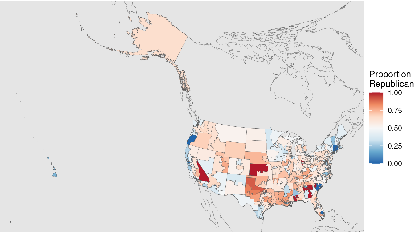
Figure 17.15: U.S. congressional election results, 2012 (Albers equal area projection).
17.7 Playing well with others
There are many technologies outside of R that allow you to work with spatial data. ArcGIS is a proprietary Geographic Information System (GIS) software that is considered by many to be the industry state-of-the-art. QGIS is its open-source competitior. Both have graphical user interfaces.
Keyhole Markup Language (KML) is an XML file format for storing geographic data. KML files can be read by Google Earth and other GIS applications. An sf object in R can be written to KML using the st_write() function. These files can then be read by ArcGIS, Google Maps, or Google Earth. Here, we illustrate how to create a KML file for the North Carolina congressional districts data frame that we defined earlier. A screenshot of the resulting output in Google Earth is shown in Figure 17.16.
nc_merged %>%
st_transform(4326) %>%
st_write("/tmp/nc_congress113.kml", driver = "kml")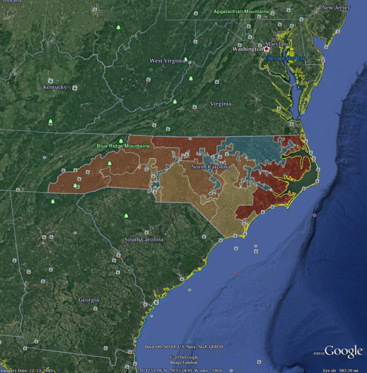
Figure 17.16: Screenshot of the North Carolina congressional districts as rendered in Google Earth, after exporting to KML. Compare with Figure 17.12.
17.8 Further resources
Some excellent resources for spatial methods include R. S. Bivand, Pebesma, and Gómez-Rubio (2013) and Cressie (1993). A helpful pocket guide to CRS systems in R contains information about projections, ellipsoids, and datums (reference points). Pebesma (2021) discuss the mechanics of how to work with spatial data in R in addition to introducing spatial modeling. The tigris package provides access to shapefiles and demographic data from the United States Census Bureau (Walker 2020).
The sf package has superseded spatial packages sp, rgdal, and rgeos which were used in the first edition of this book.
A guide for migrating from sp to sf is maintained by the r-spatial group.
The fascinating story of John Snow and his pursuit of the causes of cholera can be found in Vinten-Johansen et al. (2003).
Quantitative measures of gerrymandering have been a subject of interest to political scientists for some time (Niemi et al. 1990; Engstrom and Wildgen 1977; Hodge, Marshall, and Patterson 2010; Mackenzie 2009).
17.9 Exercises
Problem 1 (Easy): Use the geocode function from the tidygeocoder package to find the latitude and longitude of the Emily Dickinson Museum in Amherst, Massachusetts.
Problem 2 (Medium): The pdxTrees package contains a dataset of over 20,000 trees in Portland, Oregon, parks.
Using
pdxTrees_parksdata, create a informative leaflet map for a tree enthusiast curious about the diversity and types of trees in the Portland area.Not all trees were created equal. Create an interactive map that highlights trees in terms of their overall contribution to sustainability and value to the Portland community using variables such as
carbon_storage_valueandtotal_annual_benefits, etc.Create an interactive map that helps identify any problematic trees that city officials should take note of.
Problem 3 (Hard): Researchers at UCLA maintain historical congressional district shapefiles (see http://cdmaps.polisci.ucla.edu). Use these data to discuss the history of gerrymandering in the United States. Is the problem better or worse today?
Problem 4 (Hard): Use the tidycensus package to conduct a spatial analysis of the Census data it contains for your home state. Can you illustrate how the demography of your state varies spatially?
Problem 5 (Hard): Use the tigris package to make the congressional election district map for your home state. Do you see evidence of gerrymandering? Why or why not?
17.10 Supplementary exercises
Available at https://mdsr-book.github.io/mdsr2e/geospatial-I.html#geospatialI-online-exercises
No exercises found
Unfortunately, the theory of germs and bacteria was still nearly a decade away.↩︎
Note that rgdal may require external dependencies. On Ubuntu, it requires the libgdal-dev and libproj-dev packages. On Mac OS X, it requires GDAL. Also, loading rgdal loads sp.↩︎
Google Maps and other online maps are composed of a series of square static images called tiles. These are pre-fetched and loaded as you scroll, creating the appearance of a larger image.↩︎
fec12 is available on GitHub at https://github.com/baumer-lab/fec12.↩︎
The 7th district was the closest race in the entire country, with Democratic incumbent Mike McIntyre winning by just 655 votes. After McIntyre’s retirement, Republican challenger David Rouzer won the seat easily in 2014.↩︎